Peerbots
Duration
August 2020 - Current
Project Context
Non-profit work
Tools Used
Figma
Photoshop
Roles
User experience design: User flow, Wireframes, User interface design, Accessibility
Research: Focus groups, Competitive analysis, Usability testing, Feature inventory, Anscombe's quartet
Overview
Background
Peerbots is an affordable assistive technology created by Peerbots, Inc., a non-profit, to provide therapeutic services in both in-person and virtual settings. With Peerbots's software application, the therapist is able to use a mobile device to control a digital voice and face on the patient's mobile device. This technology does not require users to purchase any robots, which significantly reduces the cost of enabling technology during therapeutic services. At the same time, it operates existing robot platforms such as Misty. This application is currently available on the App Store and Google Play Store.
Project Scope
While Peerbots' application greatly benefits therapists, teachers, and people with social disabilities, there is room to improve its user experience and user interface. The concept of telepresent and content authorization confused users, especially therapists who never used technologies during their therapy sessions. The interface that requires many technical operations also overwhelmed the non-tech-savvy users. Due to limited development resources (only having one developer and limited software budget), the main goal for this project is to upgrade the user experience and accessibility within the constraints of development power.
Initial Design
1st Impression
I was introduced to the interface on the left when I started working for Peerbots. The developer built the interface using generic Unity UI components. Here is my first impression of this version of the interface:
-
Controller Interface
Original controller interface - Application screenshot -
-
Pros:
-
Easy access to all content at once.
-
Fast navigation with minimum clickings.
-
Colorful and cute interface to attract children.
-
Theme-matching robot style.
-
Differentiation between operating spaces using two color schemes.
-
-
-
Cons:
-
Inaccessible color contrast for some components.
-
Inconsistent stylings.
-
Overwhelming amount of content.
-
Unsure of what it is without explanation.
-
Too little space for the final operation screen.
-
Debug information is not hidden.
-
-
-
Face Interface
Original face interface - Application screenshot -
-
Pros:
-
Easy access to all content at once.
-
Fast navigation with minimum clickings.
-
Colorful and cute interface to attract children.
-
Adorable robot cartoon.
-
-
-
Cons:
-
Confusing data and instructions.
-
Inconsistent stylings.
-
The robot's face is covered.
-
Debug information is not hidden.
-
-
User Interface Design
Goal
For this phase, I worked with the developer to switch the color scheme and upgrade the user interface. The goal for the phase is to make the interface more readable and pleasant with minimum development changes and time. Because of the time constraint, I prioritized a few items to achieve for this phase. This design is implemented on the application currently available on the App Store and Google Play Store:
-
Controller Interface
Redesigned controller interface - Figma prototype screenshot -
-
Achieved:
-
Removed debug tools and information.
-
Used consistent styling on the entire interface.
-
Regrouped components under the same categories.
-
Rearranged panels to declutter the interface.
-
Added annotation to some buttons.
-
-
-
To do:
-
Choose more accessible colors.
-
Replace technical terms with plain language.
-
Hide unapplicable panels under certain connection modes.
-
Rearrange buttons to increase spacing.
-
Highlight selected components.
-
-
-
Face Interface
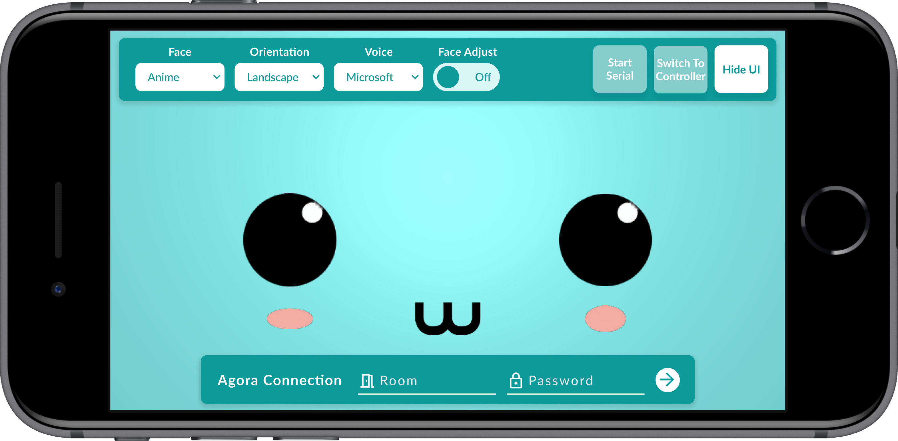
Redesigned face interface - Figma prototype screenshot -
-
Achieved:
-
Removed debug tools and information.
-
Regrouped components under the same categories.
-
Replaced some technical terms with plain language.
-
Replaced button with a toggle switch.
-
-
-
To do:
-
Choose more accessible colors.
-
Match stylings with the one from the controller interface.
-
Replace technical terms with plain language.
-
-
Result

-
You may find that the actual application looks different from the Figma prototype. That's because:
-
Unity, the development platform we use, had some development constraints.
-
We can only prioritize the development of a few designs within a limited amount of time.
-
The final application is the product of what the developer and I agreed on based on our development capacity and time.
User Experience Design
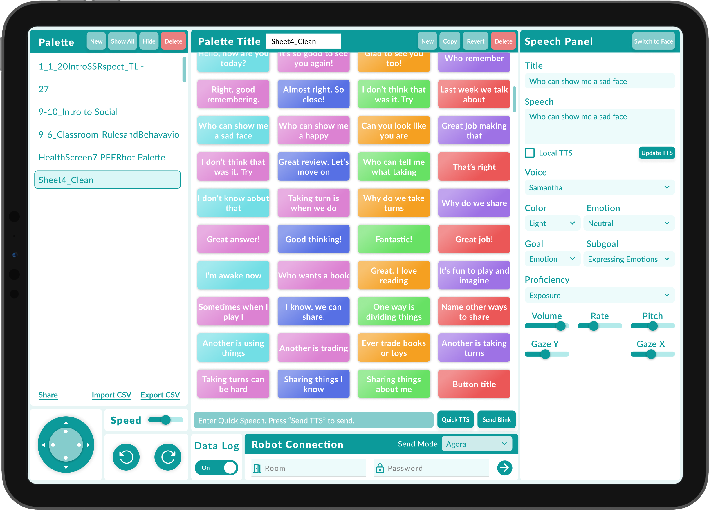
After the user interface upgrade, we successfully got support from our funding partner to improve the user experience with new user flow and cloud service. Following this guideline and my discussions with the developer and researchers, I created a high-fidelity prototype on Figma with a new user flow. In this design, user flow is more vertical which helps guide the user through the navigation process. Using this prototype, I hosted 2 focus groups with a total of 5 therapists in 2 days. All therapists were volunteers connected through our funding partner. Some of them had experience conducting therapeutic sessions with robots (including non-Peerbots products) before. I selected a few design improvements I made based on the findings we learned from the focus groups and development capacity.
Therapist: I had to use 2 devices to see the preview when authoring content.
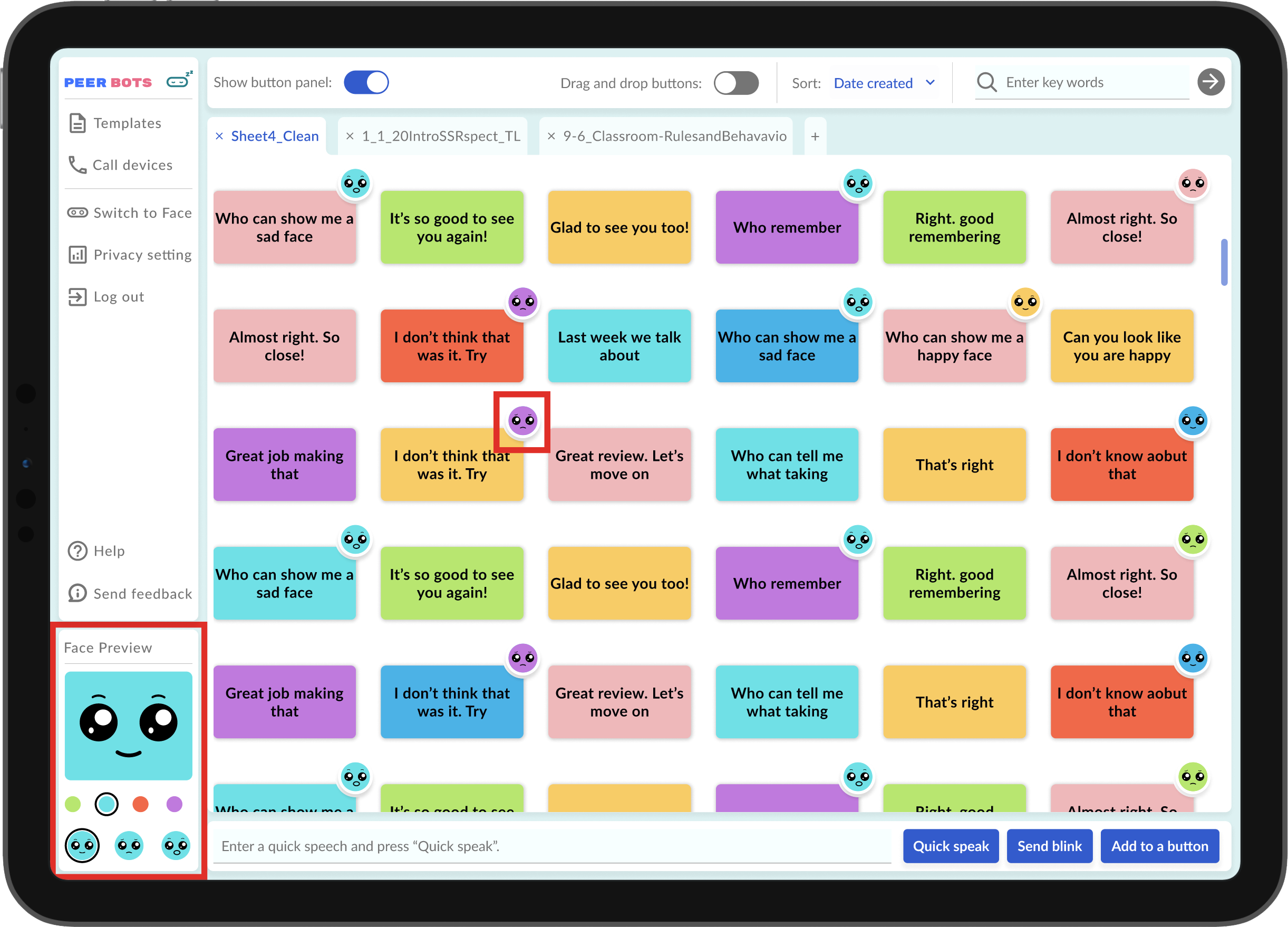
Some therapists couldn't author content with the controller device stand-alone because they couldn't see the real-time feedback of the robot face. This could be frustrating because they may not have access to two smart devices. Based on this finding, I added a face preview panel on the controller side so therapists can work on the content without having / pairing two devices.
In addition, I also added facial expression icons on the buttons so therapists can quickly identify the facial expressions associated with each button. The icon is only available for non-default options (tilt color and smiling face) to avoid cluttering the interface.
Therapist: I am not sure how to finalize the changes I made to the buttons.
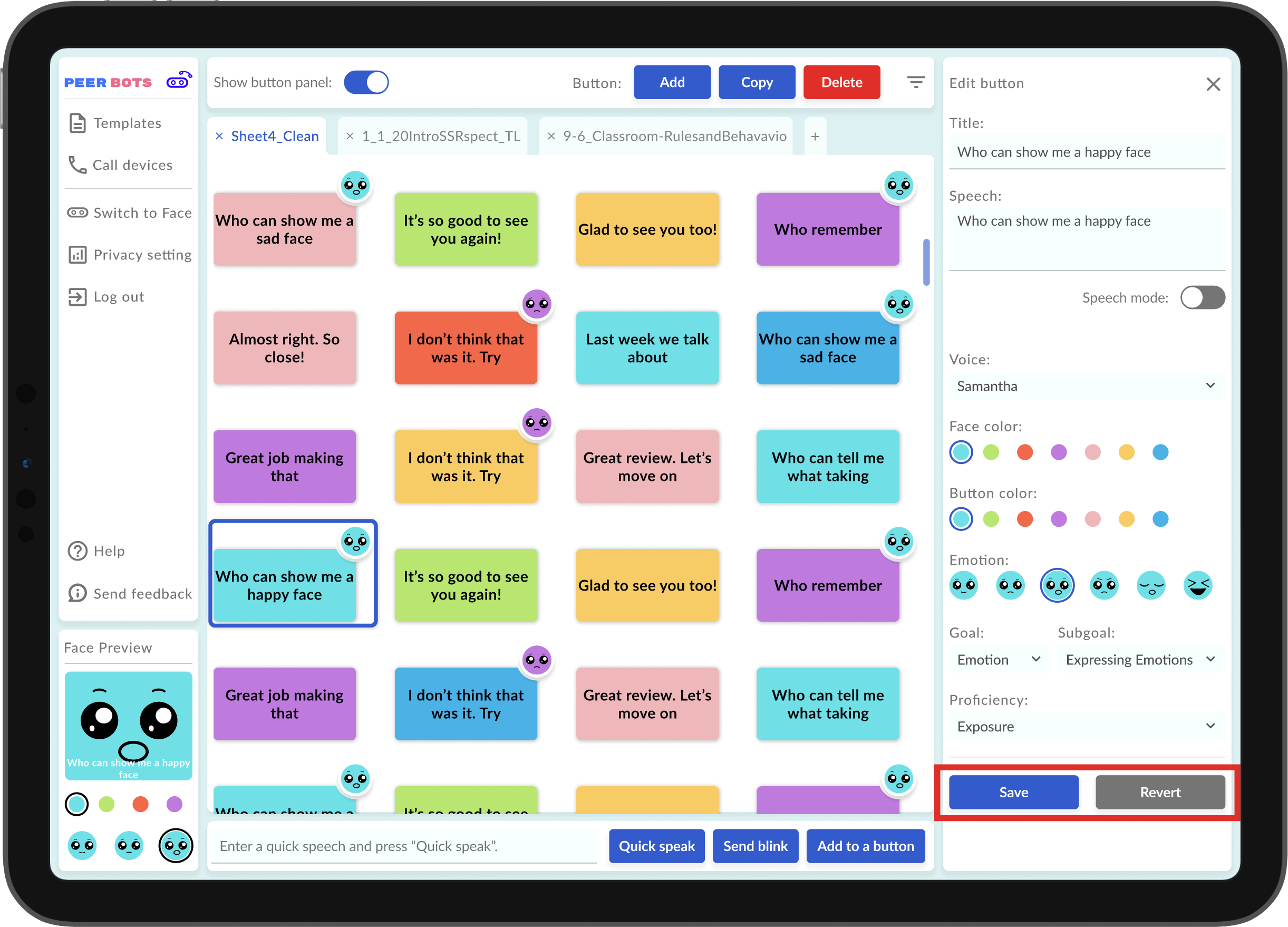
Some therapists were uncertain about their changes to the buttons. They found it unclear when and how the changes are finalized. Based on this finding, I added the "Save" and "Revert" buttons as safety measures to confirm their changes. In this way, they have complete control over the changes they desire, and their thoughts won't be interrupted by the autosave.
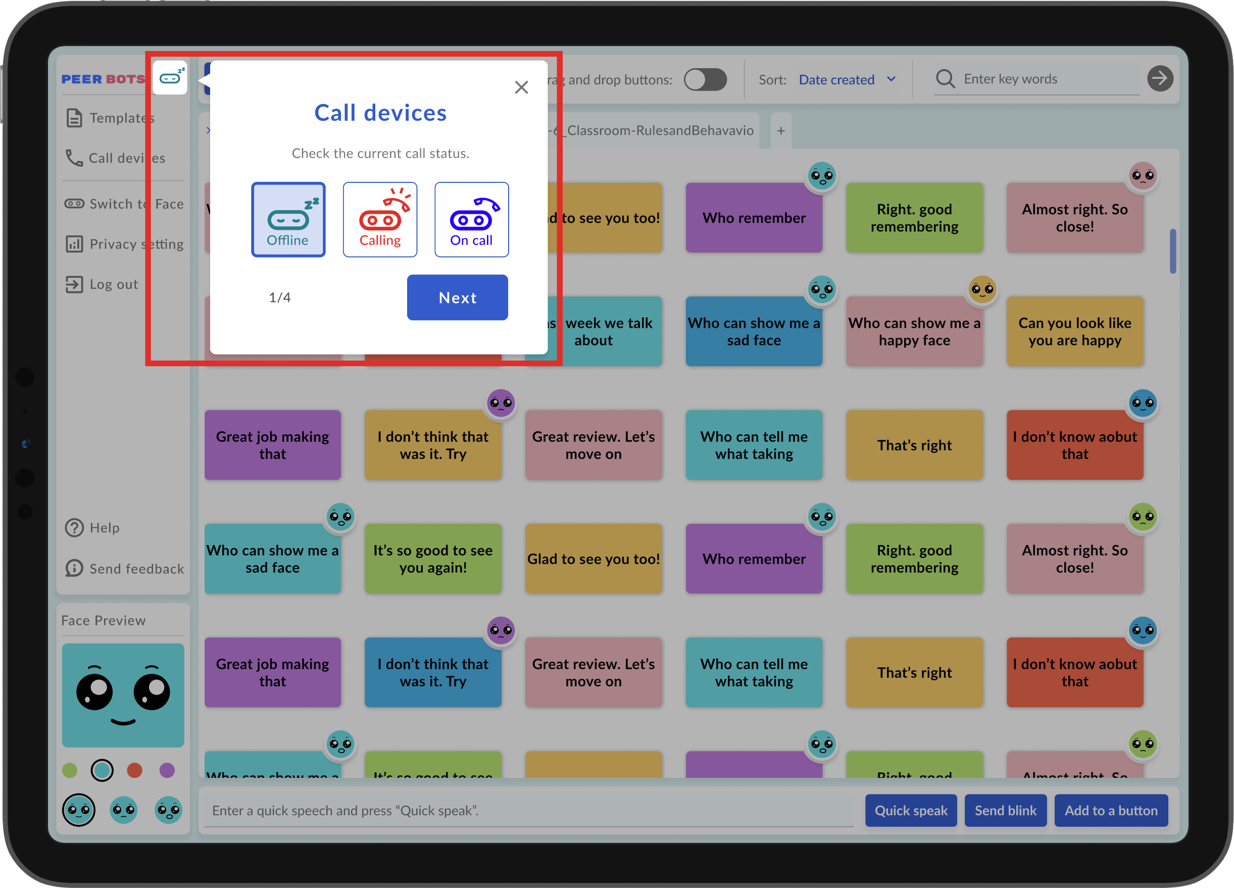
Therapist: I am not sure what the connection is or how to connect.
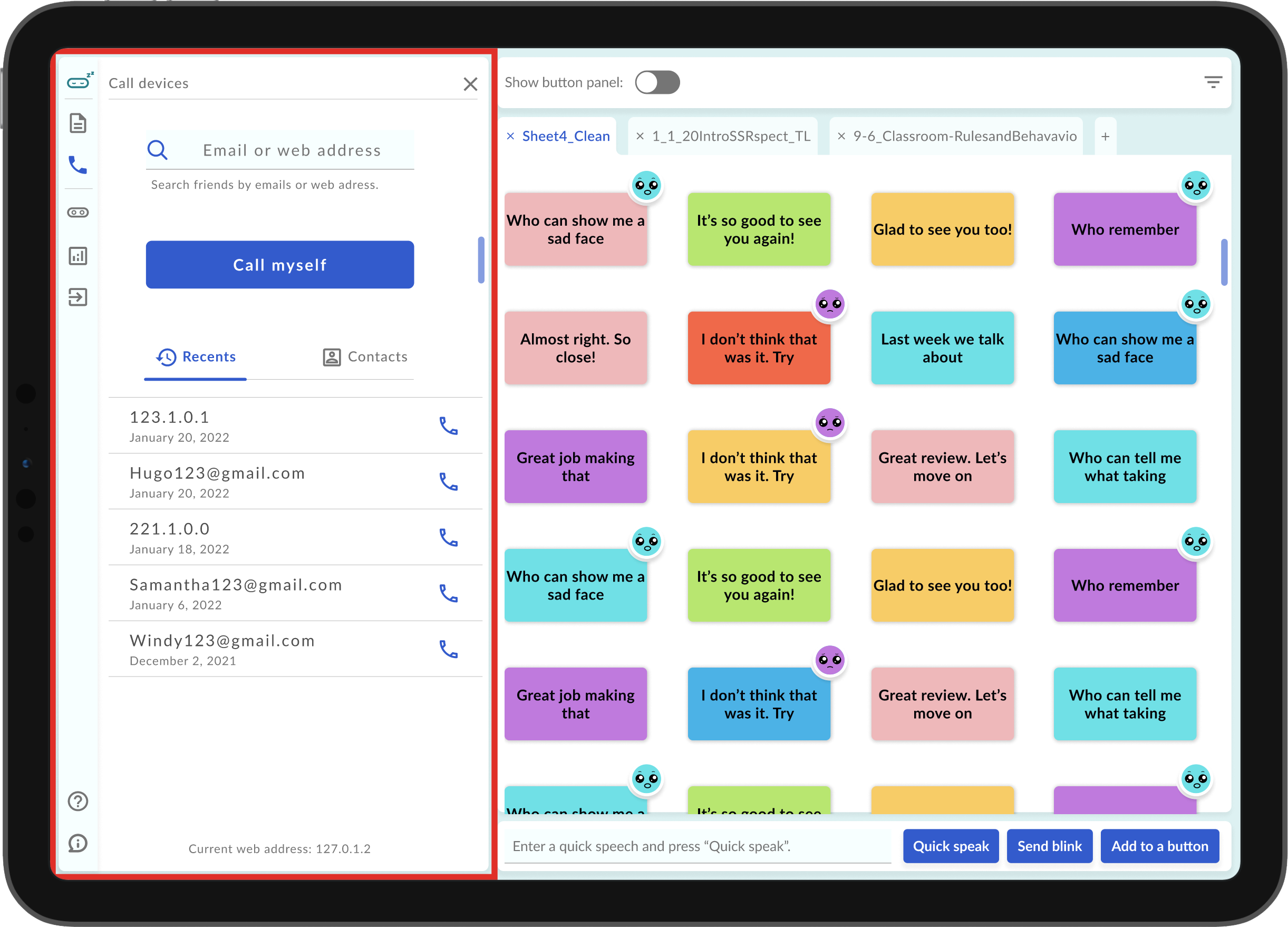
Some therapists, especially non-tech-savvy therapists, had trouble understanding the teleoperation process and how to pair the devices. The connection process was strange and confusing, especially without any explanation. To make this process more intuitive, I decided to reframe the connection process and simulate the calling process that people are more familiar with. In this way, therapists can simply pair devices by calling others' email addresses or web addresses.
Therapist: I won't click on anything that I don't know about.
Different from the generations that are more comfortable with technology, therapists who have less exposure to technology hesitated to explore the interface. Worrying about the consequence of clicking on any buttons, some therapists don't like to click on anything unless there is enough information about the button. Based on this finding, I reworded some of the buttons and created a series of tutorials to give further explanations of the product.
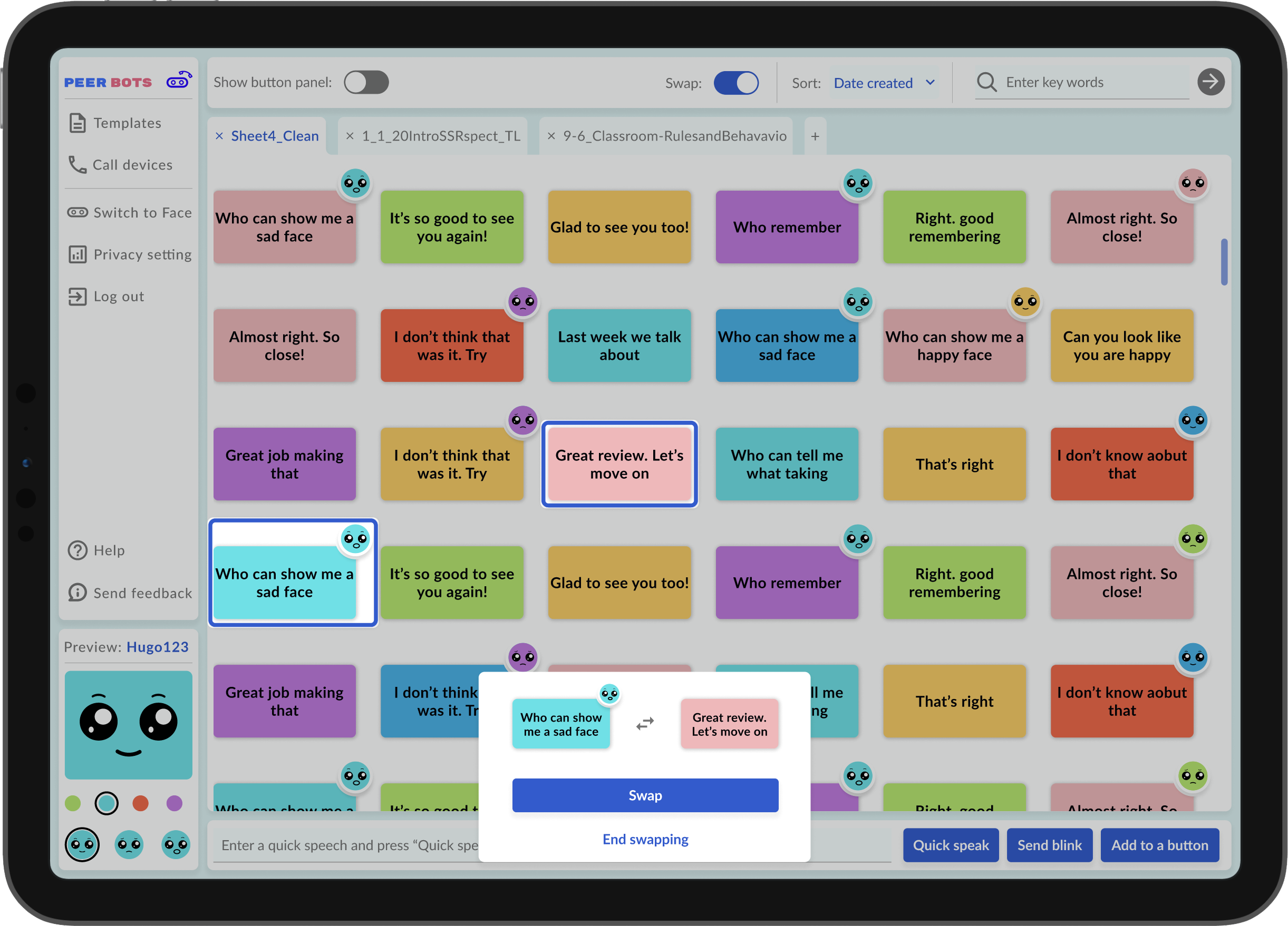
Developer: We can't prioritize developing the drag and drop feature.
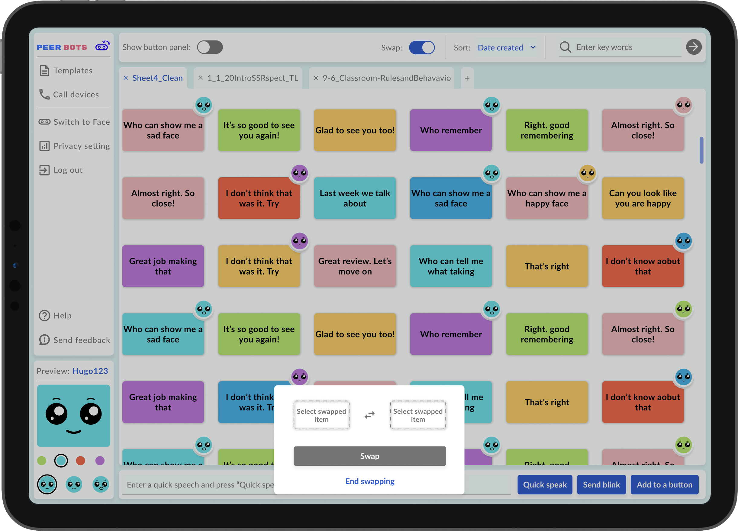
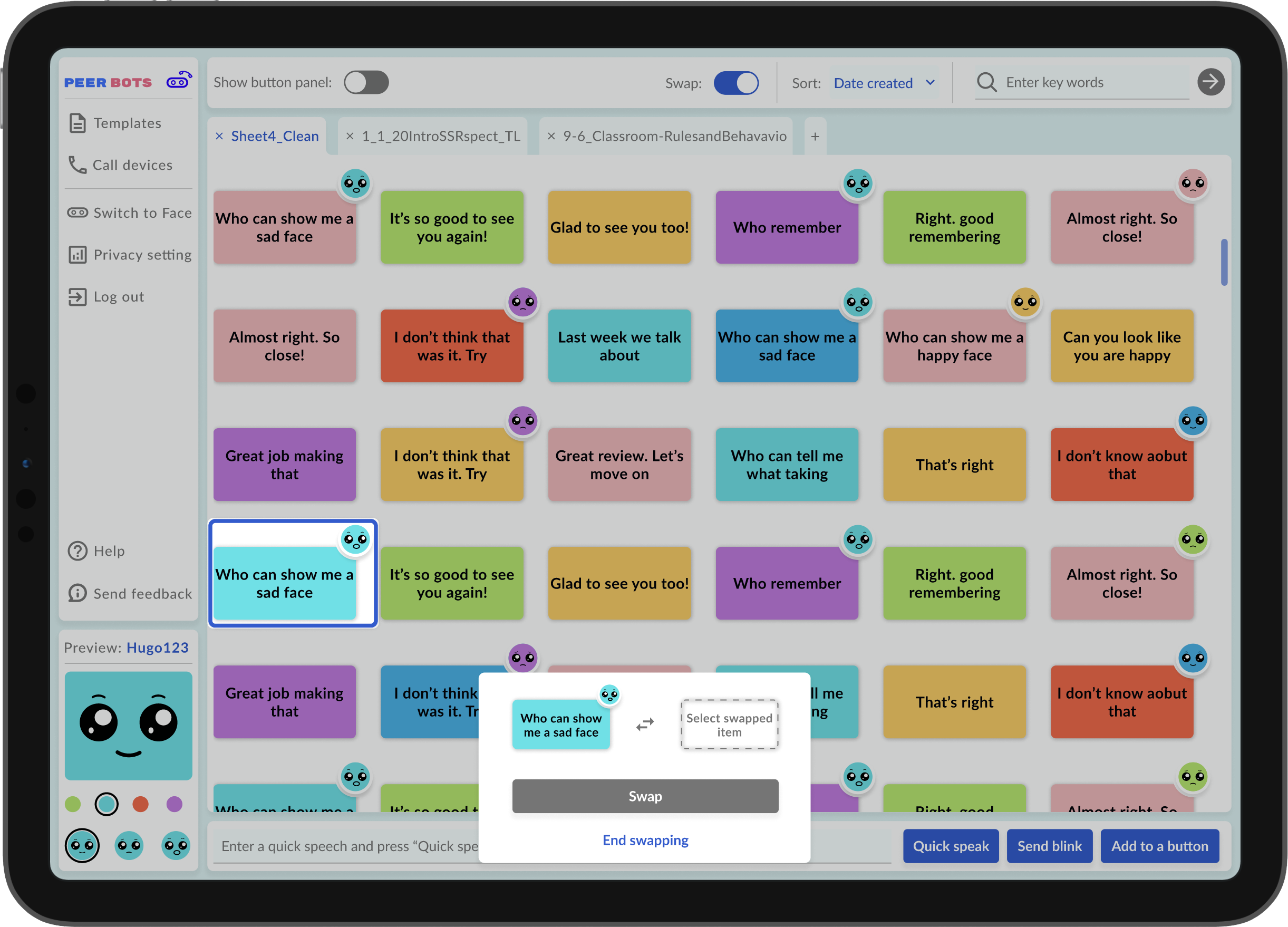
It's difficult for our sole developer to develop the drag and drop feature on Unity within a short amount of time. After understanding what is more practical to develop, I designed a 3 step swap feature. Although swapping isn't as user-friendly as drag and drop, it makes more sense to our current development capacity and project deadline. However, as we continue improving the product, the drag and drop feature will be the next feature we aim for.